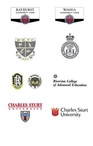
Our visual identity reflects our unique history.
From our beginnings as agricultural farms in Bathurst and Wagga Wagga in the late nineteenth century, through our evolution to include teachers colleges and then colleges of advanced education, Charles Sturt University has grown into the largest regional university – and most experienced online university – in Australia.
Our visual identity has evolved over the years too, from rustic hand-drawn illustrations to today's vibrant and symbolic crest.
For our 30th anniversary we undertook a major brand transformation. We consulted and collaborated with current and former staff and students, and we listened to our communities. Then we took our historic graphic logos and ushered them into our next era with the launch of Charles Sturt's new visual identity in May 2019.
Want to know more about Charles Sturt University's history? Or our strategy for the future? We're about creating a world worth living in – we always have been and we always will be.

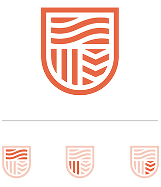
Our crest draws on Charles Sturt University's original coat of arms and the logos of our predecessor institutions. It's a contemporary expression that takes pride in our heritage and looks forward to our exciting future.
The crest's design is inspired by the concept of a ripple effect. As we work with our students, communities and partners, our joint efforts extend out to help create a world worth living in.
It includes patterns that draw on the culture and symbolism of Indigenous Australians, inspired and informed by the traditional custodians of the land on which our campuses sit. The crest also echoes the landscapes of regional NSW.

The rivers represent Captain Charles Sturt's spirit of exploration and discovery; they symbolise the location of our foundation campuses.
The field is symbolic of our proud agricultural heritage.
The book represents our tradition of learning and inquiry; a seeking for truth, information or knowledge.
Our colour palette is inspired by our connection to our communities.
Ochre was chosen as our main colour as it is natural and earthy, which reflects our brand framework and unique personality traits.
Our extended colour palette symbolises our regions, the land and the people – from country to coast.
